Project Overview
Creator's Summit is a multi‑day gathering for designers, developers, filmmakers, and digital storytellers who come together in Kathmandu, Nepal to learn, share ideas, and collaborate. The organizers wanted a logo and brand identity that felt energetic and modern, but still trustworthy and easy to use across digital and print applications.
Our studio was invited to create a complete event branding system: a primary logo, logo variations, color palette, typography, and key applications for social media, stage visuals, and on‑site signage. This logo design case study walks through the full process from concept to final implementation.
Timeline
3 weeks
Deliverables
Logo suite, color system, typography, event graphics
Scope
Brand strategy, logo design, event branding
Design Concept
The creative direction for the Creator's Summit logo started with a simple idea: rising together. The event brings many different types of creators into the same space, so we focused on visuals that represent growth, community, and shared momentum rather than a single discipline or tool.
We combined a bold, friendly wordmark with a stylized mountain peak and sunrise. The peak signals the location and the challenge of climbing higher, while the rising sun stands for new projects, fresh perspectives, and the start of long‑term collaborations. This clear story guided every decision in the brand identity.
Core theme
Creators rising together
Visual anchors
Mountain peak, sunrise, stacked wordmark
Brand tone
Bold, optimistic, welcoming
Logo Concept & Construction
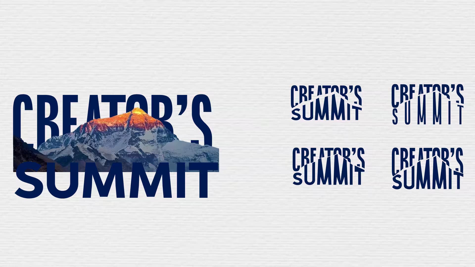
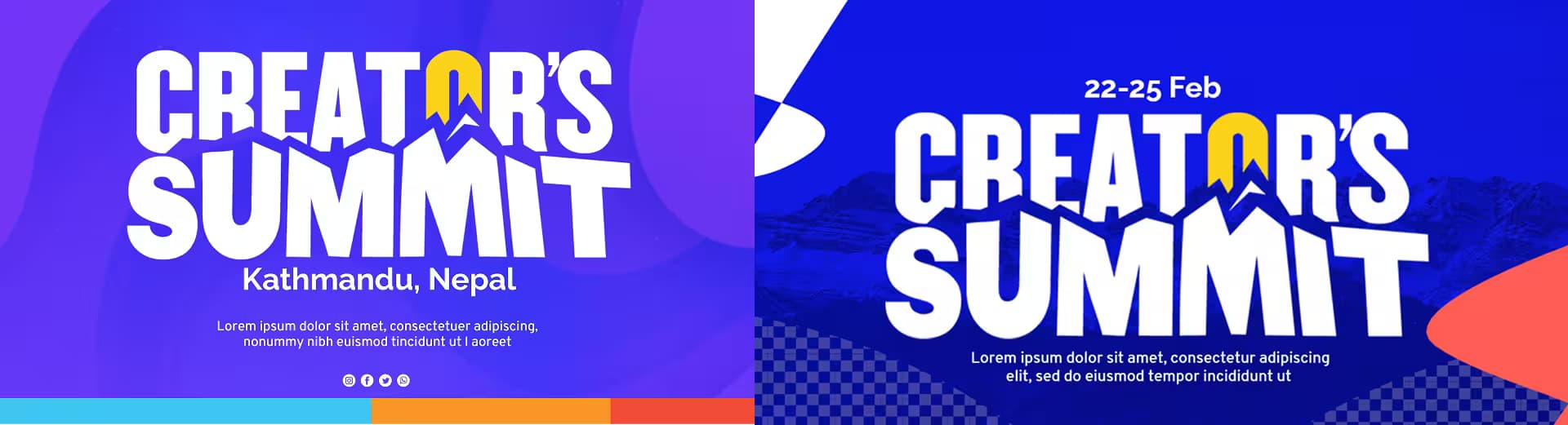
The logo combines a stacked wordmark with a central peak icon and circular sunrise. The letterforms are heavy and rounded to feel confident but approachable, making the logo easy to recognize at a distance and in small digital sizes.
Each element of the logo was designed to support the event story. The peak shape references Nepal's mountains, the negative space under the peak forms a subtle path leading upward, and the yellow sunrise adds a bright point of focus that naturally draws the eye into the mark. This structure keeps the logo simple while still packed with meaning.
Wordmark
Stacked uppercase letters with soft corners create a solid, friendly foundation for the logo.
Peak alignment
The central peak sits between the words, aligning vertically to create a strong focal point.
Sunrise
A circular sunrise shape sits above the peak to symbolize new ideas and shared energy.
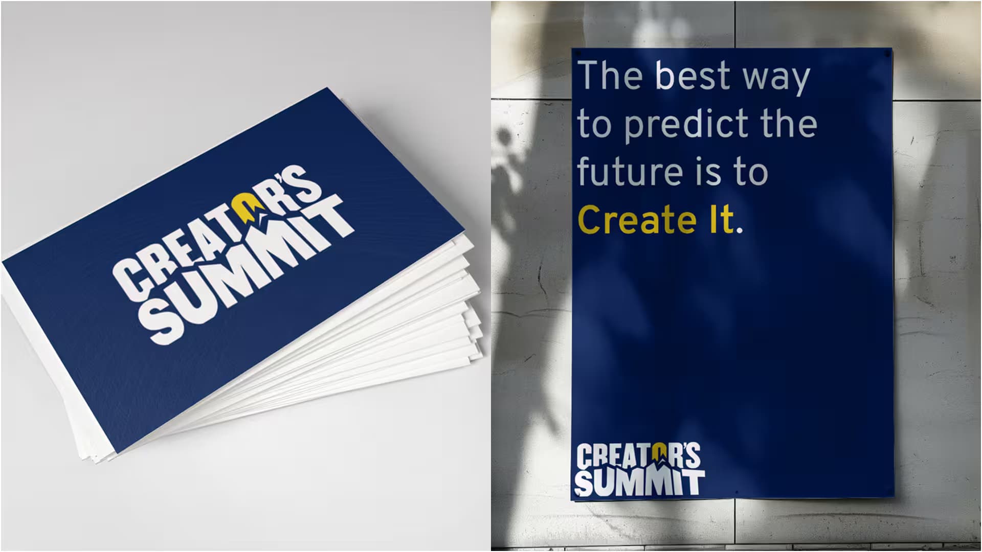
Clearspace & Scalability
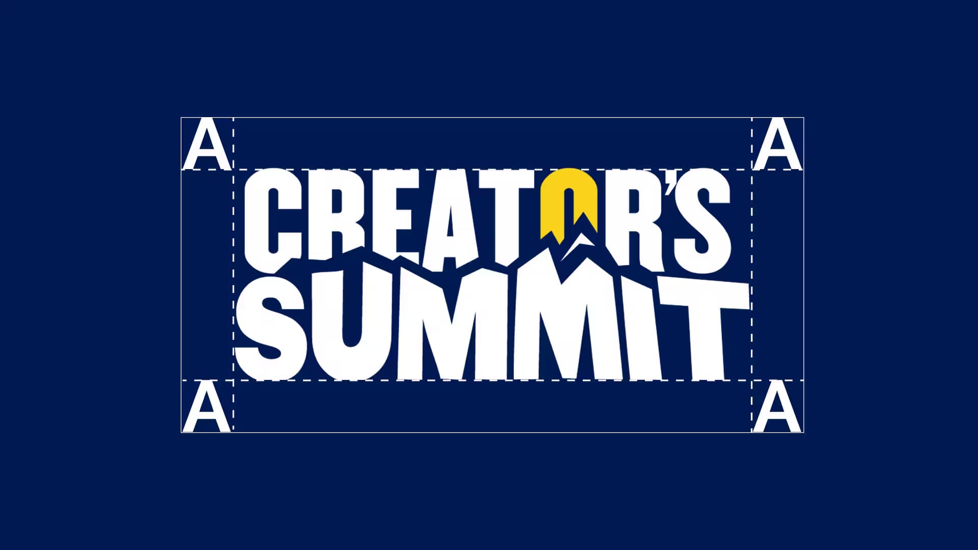
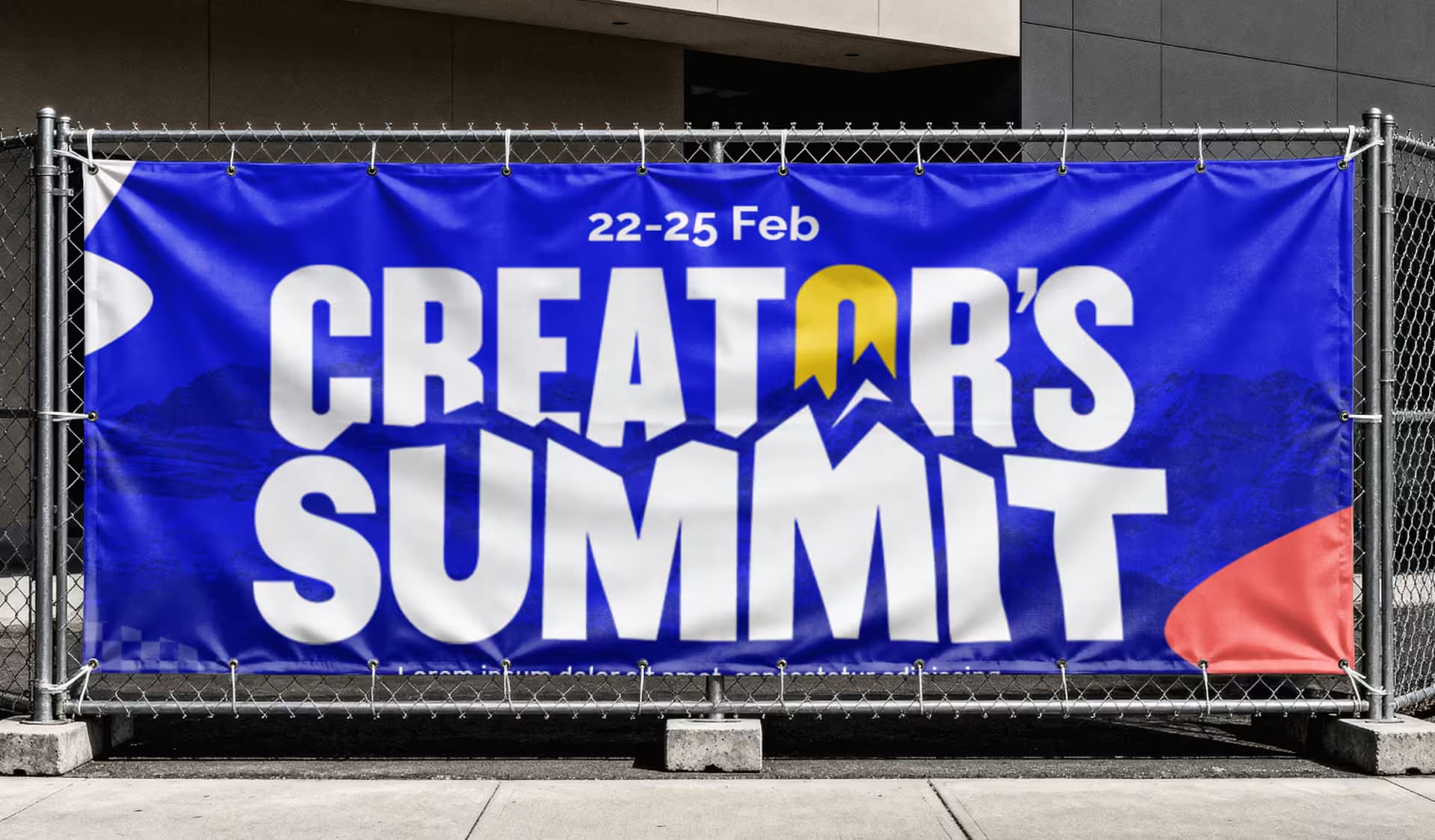
Because the logo needed to appear on everything from social avatars to large‑format stage banners, clearspace and minimum‑size rules were essential. We defined a simple spacing system based on the height of the letters so that the logo always has enough breathing room, even on busy layouts.
The mark was tested at small sizes for digital use and at large scales for flags, fences, and projection screens. By refining the proportions, we ensured that the Creator's Summit logo remains legible and balanced wherever it appears.
Brand Typography
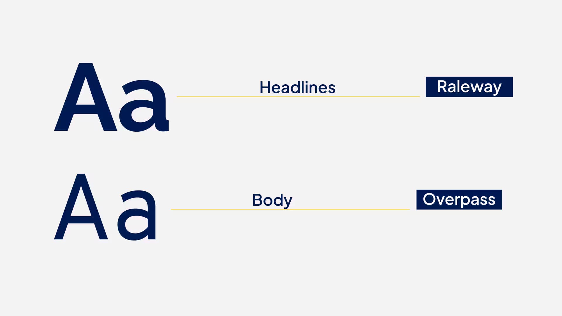
Typography plays a major role in how the event feels. For the Creator's Summit identity, we paired a bold display typeface for headlines with a clean, highly legible sans‑serif for supporting text. This combination works well for everything from energetic hero graphics to dense schedules and speaker descriptions.
The rounded shapes of the headline font echo the friendly curves in the logo's letterforms, while the body type focuses on clarity. This keeps the brand personality consistent and ensures information is easy to scan on both desktop and mobile devices.
Headline Typeface
- •Bold, geometric sans‑serif for titles and key messages.
- •Used on hero graphics, stage slides, and large banners.
Body Typeface
- •Modern, neutral sans‑serif for paragraphs and UI text.
- •Used on the website, printed materials, and long‑form content.
Brand Colors
The color palette is built around midnight blue, bright yellow, and supporting dark neutrals. The blue gives the identity structure and reliability, while the yellow adds energy and draws attention to important information like dates and calls‑to‑action.
Subtle gradients and textured backgrounds bring motion to digital layouts without overpowering the logo. This balance lets the color system feel exciting on event banners while still being flexible for long‑term brand use.
Midnight Blue
#0A1E4A
Primary background, headings, and strong brand blocks.
Summit Yellow
#F9C928
Sunrise element in the logo, highlights, and key buttons.
Soft Grey
var(--color-muted)
Backgrounds, dividers, and subtle frames.
Dark Grey
#111827
Body text and deep accents.
Brand Expression & Applications
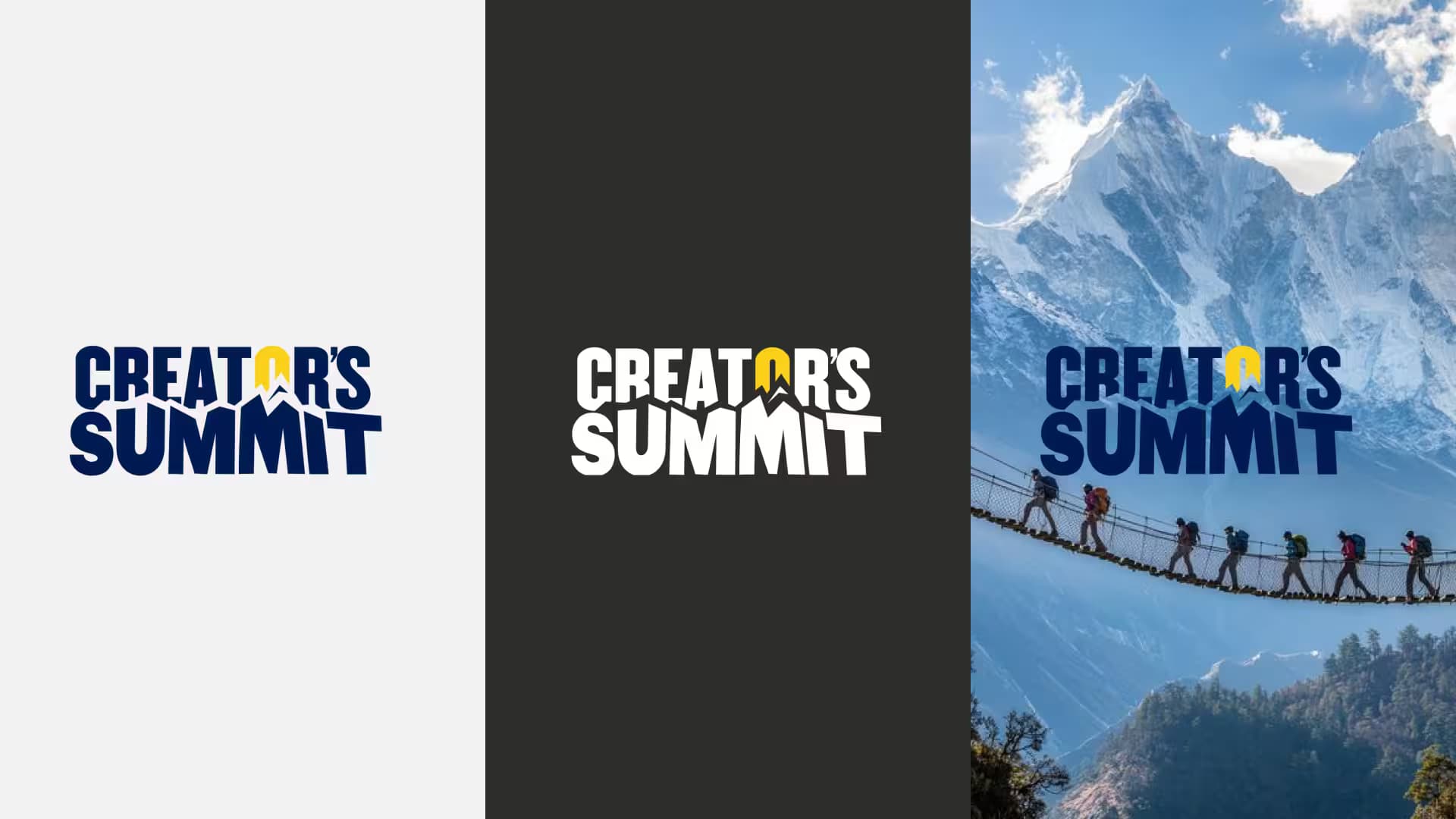
With the logo, typography, and colors in place, we extended the Creator's Summit identity into real‑world applications: event landing pages, social posts, presentation slides, tickets, and on‑site signage. Each piece uses the same visual language so that the brand feels cohesive from first announcement to closing keynote.
Large gradients, layered shapes, and repeating peak motifs give the layouts movement and depth. At the same time, clear typography and strong hierarchy keep essential information like dates, times, and locations easy to find.
Outcome & Results
The new logo and event branding gave Creator's Summit a strong visual identity that attendees and partners could recognize instantly. The stacked wordmark and peak icon photographed well on stage, appeared clearly in social media recaps, and helped the summit feel like a unified, professional experience.
By delivering a flexible logo system and reusable templates, the organizing team can now launch future editions of the Creator's Summit faster, while keeping the visual language consistent and memorable.
Highlights from this logo design case study
- ✓Distinctive logo system that stands out among other conference brands.
- ✓Consistent event branding across web, print, and environmental graphics.
- ✓Streamlined production process using ready‑to‑go layouts and assets.
Reflection & Takeaways
This logo design case study shows how a simple story—creators rising together—can guide an entire brand identity, from the first sketch to the final event photograph. When the concept is clear, it becomes much easier to make consistent design decisions and evaluate new ideas against the brand goals.
For teams planning a conference or community event, investing in thoughtful event branding pays off in recognition, trust, and long‑term growth. A well‑designed logo system gives every edition of the event a familiar face, while still leaving room for evolution over time.